Welcome.
In 2010, I founded Willoid Art & Design with a vision to deliver creative, versatile, and impactful design solutions. Since then I have had the pleasure of collaborating with a diverse range of clients—from local businesses in the Kootenays to international brands.
I offer logo and packaging design, brand development, typesetting, web design, clothing design and production, multimedia production, and creative consultation.
My work focuses on clear communication, strong visual identity, and thoughtful execution across print and digital platforms. I approach each project with a focus on clarity, utility, and aesthetics — creating design that feels as good as it functions.
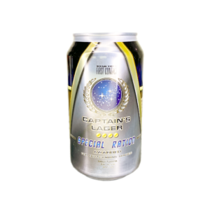
My portfolio includes projects such as designing public signage for the Nelson Izu-Shi Friendship Garden, packaging design for Torchlight Brewing Co., licensed designs for Federation of Beer’s Star Trek-themed brews, and developing e-commerce platforms for companies like Mountain Baby, Island Toys & Hobby, and KL Skin Naturals. Whether it’s crafting a visual identity, building an online presence, or producing promotional materials, every project is a collaboration and an opportunity to bring ideas to life with clarity and impact.
– Will Taylor
Branding, Print, & Packaging
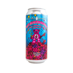
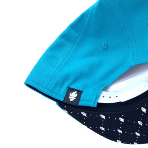
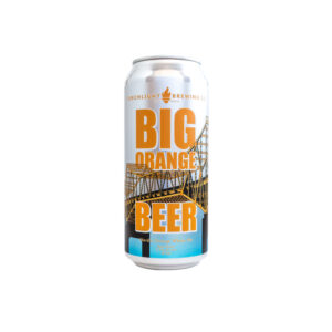
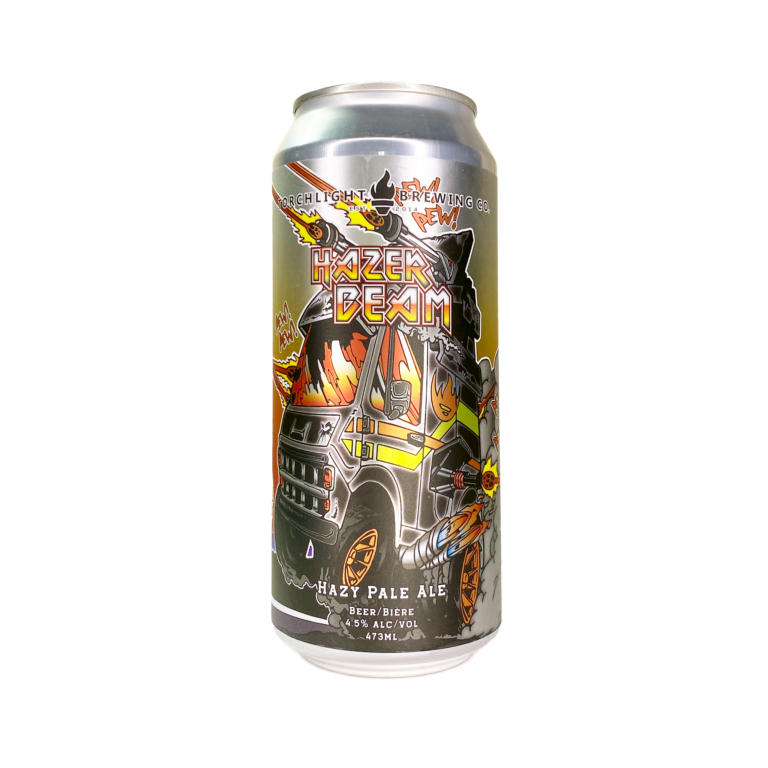
Since 2017 I have worked closely with the Torchlight Brewing Co. team to develop a cohesive and recognizable brand presence across multiple touchpoints. This includes conceptualizing and designing product packaging that reflects the brewery’s bold and creative spirit, as well as producing original artwork that brings their unique beer offerings to life. For special edition releases, I manage other talented artists to create limited-run designs that highlight the brewery’s artistic edge while maintaining alignment with their core identity.
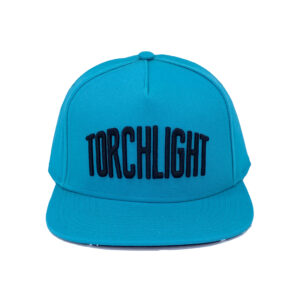
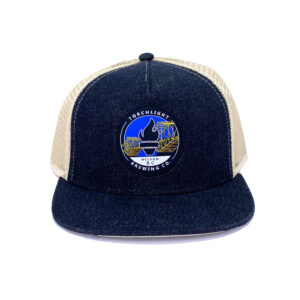
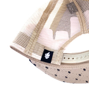
In addition, I manage their range of branded merchandise design, key in-store and event signage, and marketing and promotional materials tailored to both print and digital platforms. Throughout the process, I ensure consistency in visual identity while aligning with Torchlight’s evolving goals and audience—helping to strengthen their position in a competitive craft beer market.
torchlightbrewing.com
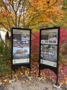
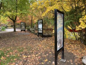
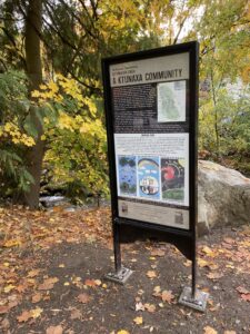
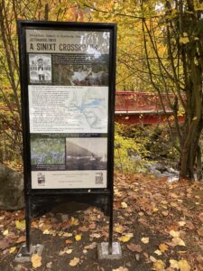
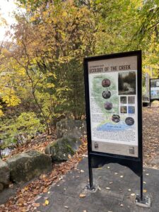
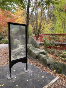
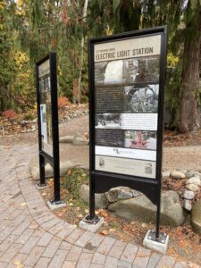
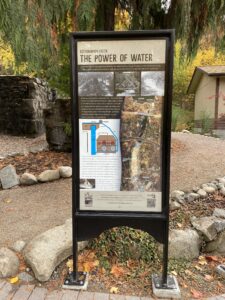
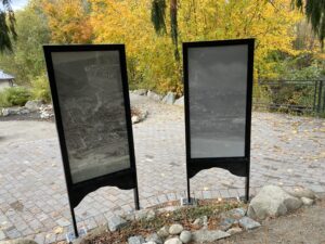
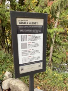
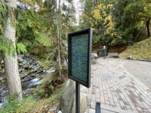
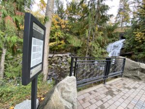
In 2019, I was invited by the Nelson Izu-Shi Friendship Society to design a series of educatioonal signs for the Friendship Garden at Cottonwood Falls Park in Nelson, BC—a traditional Japanese garden developed and maintained by the Society. The project culminated in the installation and unveiling of the signs in October 2024.
This was a highly collaborative and rewarding undertaking involving many individuals, organizations, and local businesses. The work required navigating complex content, cultural considerations, and technical constraints to produce signage that is both informative and visually integrated with the garden’s natural and cultural setting.
It was an honour to contribute to such a meaningful community space. If you’re in the area, I encourage you to visit the park—or explore the online information hub at nelsonizushi.com, where all sign content is available.
In 2022 I collaborated with Aaron Banfield to create a symbol for a faith-neutral sacred/healing space at the Kootenay Boundary Regional Hospital in Trail BC. Aaron was a patient in hospice care at the hospital, and he was instrumental in creating the space in the years before he passed. The specially outfitted room is a place where patients, visitors, and staff can retreat for a moment of peace or observe religious/spiritual practices. It was important to Aaron to provide future patients with a comfortable space away from the usual complications and function-dominant aesthetic of the rest of the hospital, and he spent the last years of his life advocating for this project. The room included devotional objects from a variety of faiths and spiritual disciplines, as well as a sound system and special ventilation to allow for smudging, incense, and candles.
The symbol needed to represent this non-denominational and all-inclusive approach, suggesting the spiritual link and inspiration for the space without directly referencing any specific religious iconography. Our final design evokes the most basic foundations of life we all share; the sun and moon, earth, air, fire, and water, the plants of the natural world and the cycle of seasons.

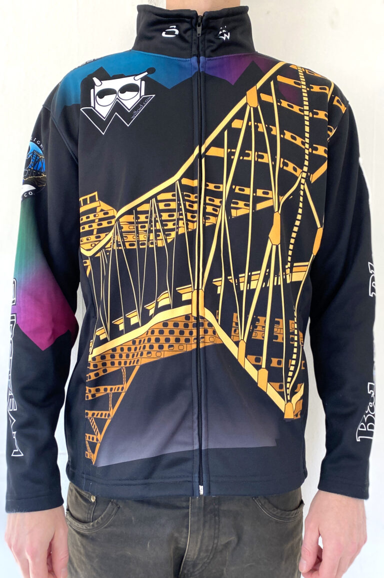
I design custom jerseys and jackets for a range of competitive curling teams, working closely with players to reflect their identity while meeting the specific requirements of sponsors and organizing bodies. Each concept considers how graphics translate onto the printed garments and ensures high visibility for televised events—where clarity, contrast, and brand recognition are key. My work balances bold, distinctive aesthetics with functionality, resulting in uniforms that perform well both on the ice and on screen.
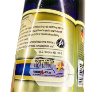
Since 2022, I’ve worked with Federation of Beer—the official international craft beer production partner for Star Trek—to develop unique, limited-edition beer packaging and promotional materials. Each design captures the essence of the Star Trek universe while aligning with brand standards and undergoing a rigorous approval process with license stakeholders.
In addition to packaging and artwork, I’ve contributed to collaborative fundraising campaigns, supporting charitable causes through themed design and merchandise.
Explore more at federationofbeer.com.
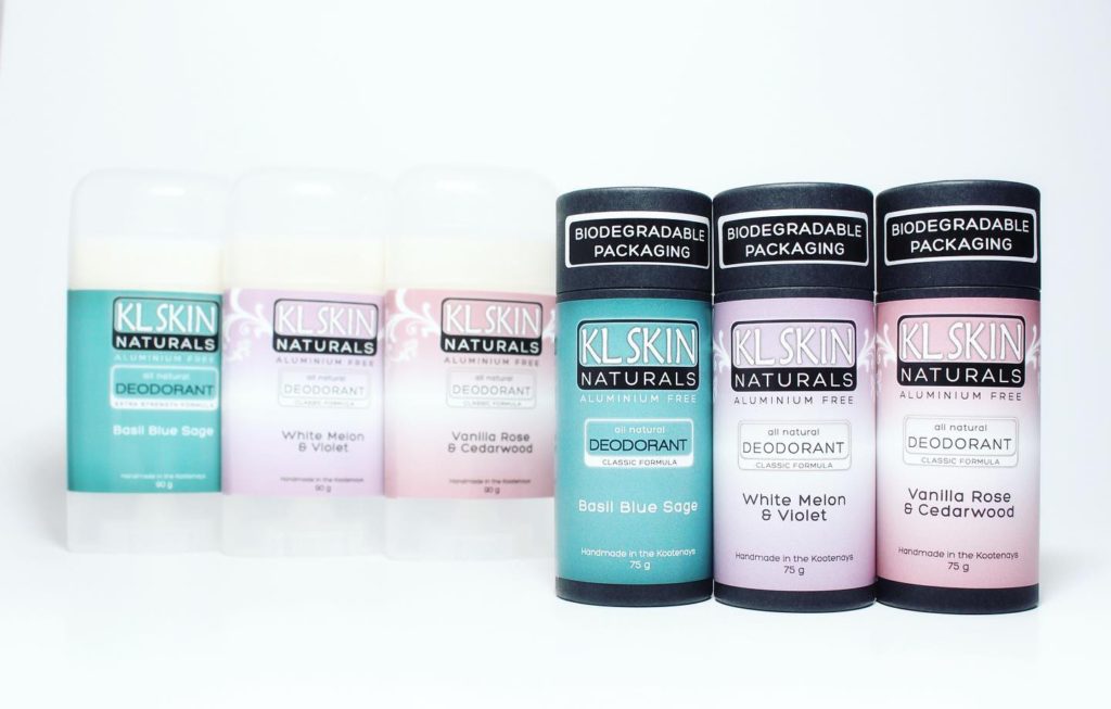
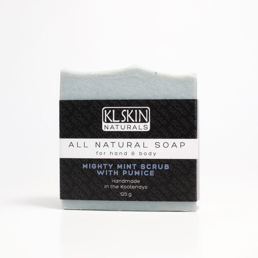
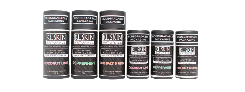
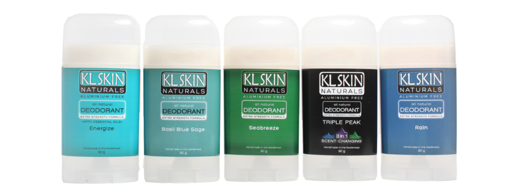
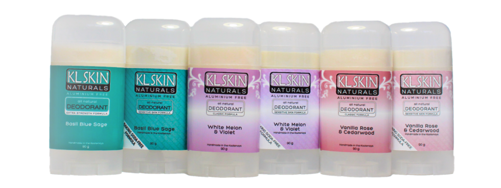
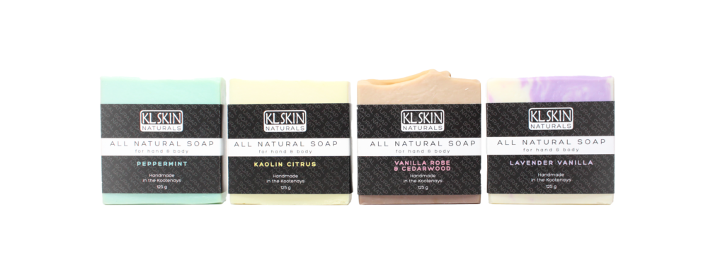
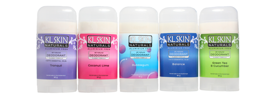
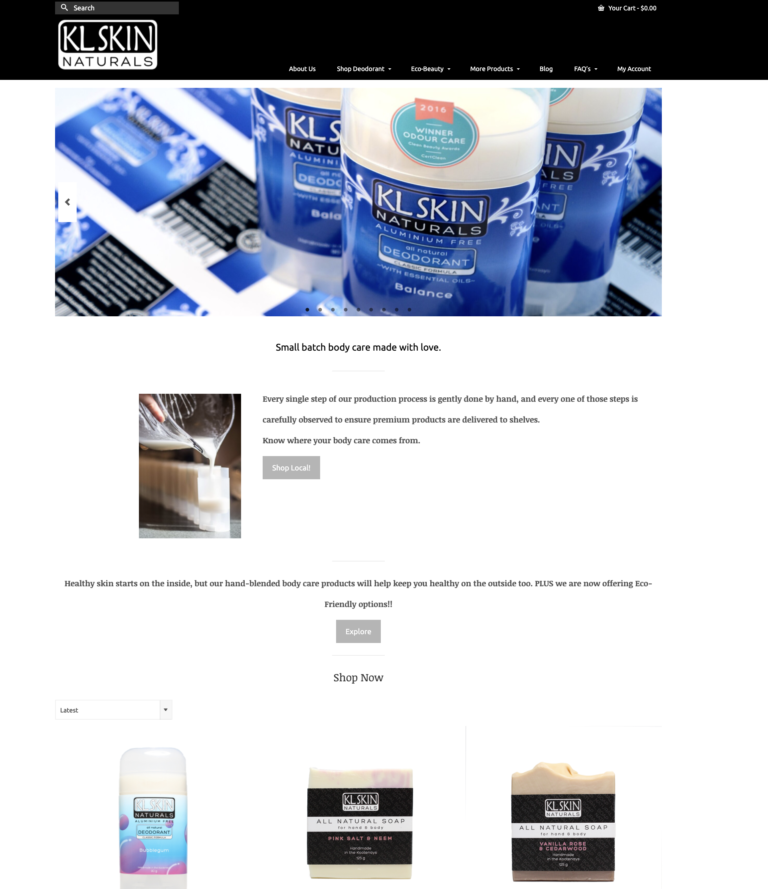
I collaborated with the business owner to design packaging and logos for a range of skincare products, creating a strong brand identity for the product line. In addition, I managed the development of a WordPress e-commerce site and led the successful transition to Shopify, ensuring a smooth shift to a more scalable and user-friendly platform.
Explore more at klskindeodorant.com.
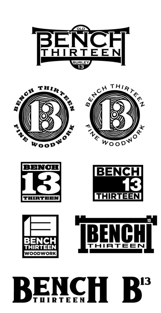
I worked with founder to develop the logo and brand identity for Bench 13 Woodcraft, a company specializing in handcrafted wood products. The work focused on creating a visual identity that reflects the brand’s craftsmanship, attention to detail, and connection to natural materials. Deliverables included a versatile logo suite and brand elements designed for use across packaging, clothing & merch, signage, and digital platforms.
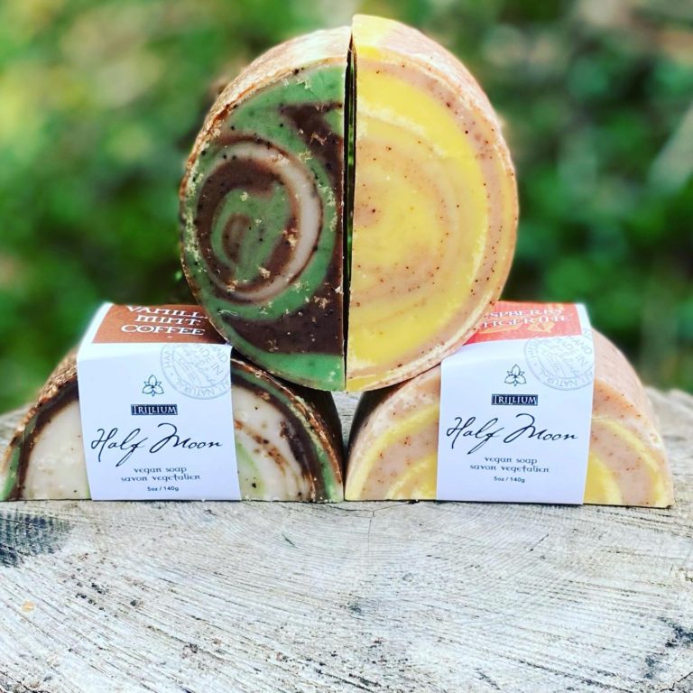
I collaborated with Trillium Handmade Soaps and Candles to design and refine packaging that reflects the brand’s artisanal quality and natural aesthetic. The work involved applying a cohesive visual identity across a variety of products, ensuring each design aligned with the overall brand while accommodating different formats, scents, and product types.
I worked with a bulk distributor to develop a new look for the packaging and branding of Azomite, a natural soil amendment product, with targeted design solutions for two distinct market segments. One version was tailored to appeal to residential hobby gardeners, featuring approachable, consumer-friendly aesthetics. The second version was designed for professional hydroponic growers, using a more technical and performance-focused visual language. This dual-approach ensured brand consistency while effectively addressing the needs and preferences of different customer demographics.
Hickshow Productions creates high-adrenaline video content focused on extreme snowmobiling. I worked with their team to design a bold, recognizable logo and visual identity that reflects the energy and intensity of their brand. My contributions included DVD cover artwork, editing assets, and branding consultation to ensure consistency across their physical media and promotional materials.
I collaborated with Land Loved to develop a visual identity that reflects its grounding in nature-based healing and feminine empowerment. This includes logo and packaging development for their line of handcrafted herbal tinctures, and technical support for their website. The work focused on creating a brand presence that feels both rooted in nature and refined in aesthetic, aligning with the practice’s values and offerings. Land Loved is a holistic wellness practice based in Nelson, BC, offering herbal tinctures, shamanic counselling, and women’s circles rooted in the Wise Woman Tradition.
Explore more at landloved.com.

Book cover design. Coming Soon!
UI/UX & Interactive Design
Check out my weather forecast app here!
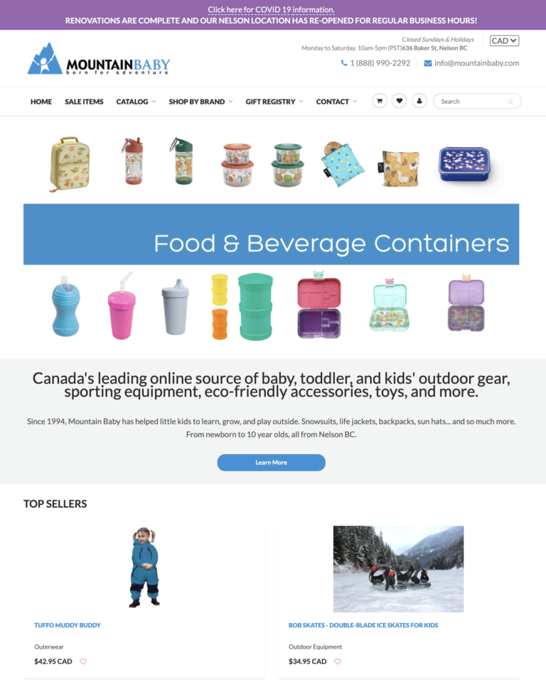
From 2017 to 2025 I led e-commerce development and design for Mountain Baby, a brick-and-mortar and online retailer specializing in outdoor gear, toys, and games for babies and toddlers. What began as a short-term contract evolved into a full-time role, during which I managed a wide range of responsibilities including Shopify-based website development, signage, promotional design, marketing assets, Google Ads integration and compliance, and inventory and shipping systems.
A major focus of the role involved complex POS and e-commerce integrations. I oversaw the transition from Microsoft RMS to Shopify POS, ensuring seamless compatibility with the existing Shopify storefront. I later managed the full switchover for a second retail location previously running on Lightspeed POS. My work helped streamline operations across sales channels and improve the customer experience both online and in-store.
Explore more at mountainbaby.com.
I collaborated with the business owner to design packaging and logos for a range of skincare products, creating a strong brand identity for the product line. In addition, I managed the development of a WordPress e-commerce site and led the successful transition to Shopify, ensuring a smooth shift to a more scalable and user-friendly platform.
Explore more at klskindeodorant.com.
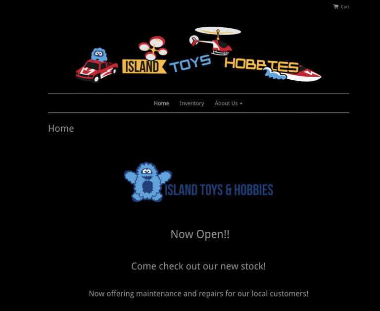
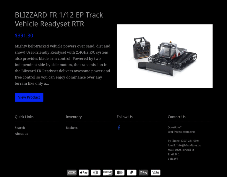
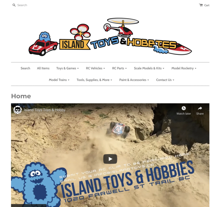
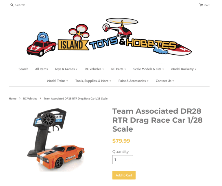
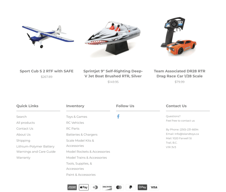
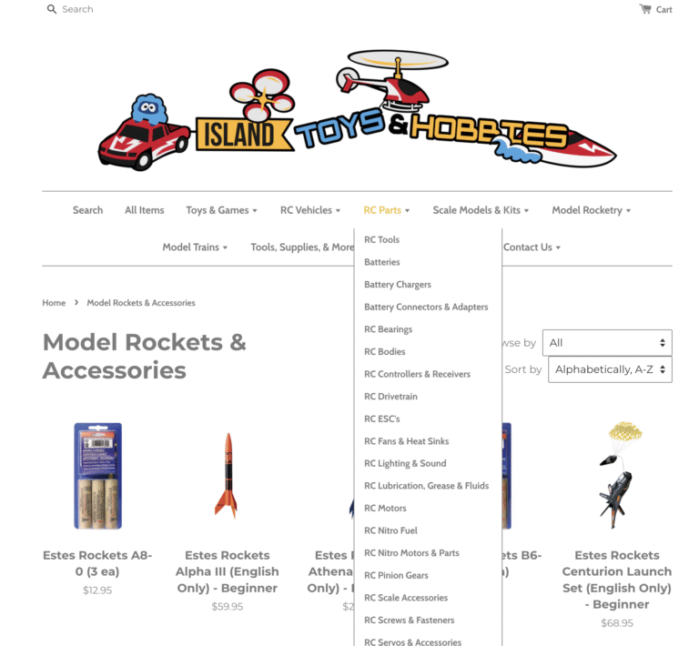
I redesigned the eCommerce website for Island Toys, a large-inventory hobby retailer, with a focus on enhancing user experience and optimizing product navigation. The project included a complete visual overhaul, implementation of advanced product filtering, and improvements to inventory organization and management. The updated design significantly improved UI/UX, resulting in a more intuitive and engaging shopping experience for customers.
Visit: islandtoys.ca
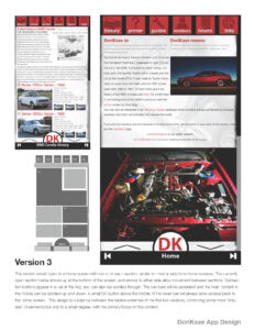
This conceptual project explores a modern redesign for Dorikaze, a forum-based online community dedicated to vintage Japanese car enthusiasts. The study focuses on improving usability, visual hierarchy, and mobile accessibility while preserving the grassroots spirit of the original site. The concept includes responsive web layouts and a companion mobile app design aimed at enhancing community interaction and content discovery.
(click sections to view examples)

